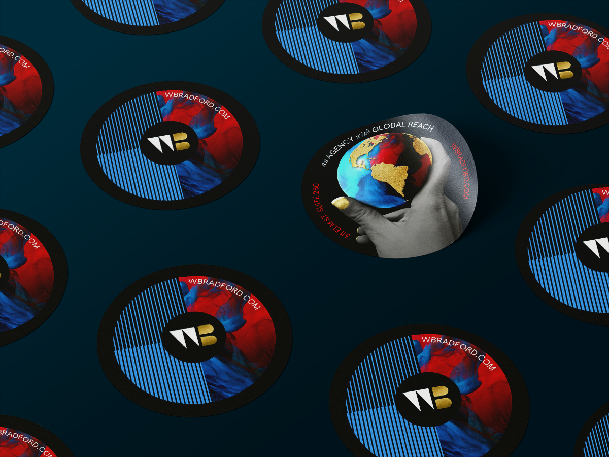
W.Bradford is a full service marketing agency servicing companies both in the Cincinnati area as well as around the world.
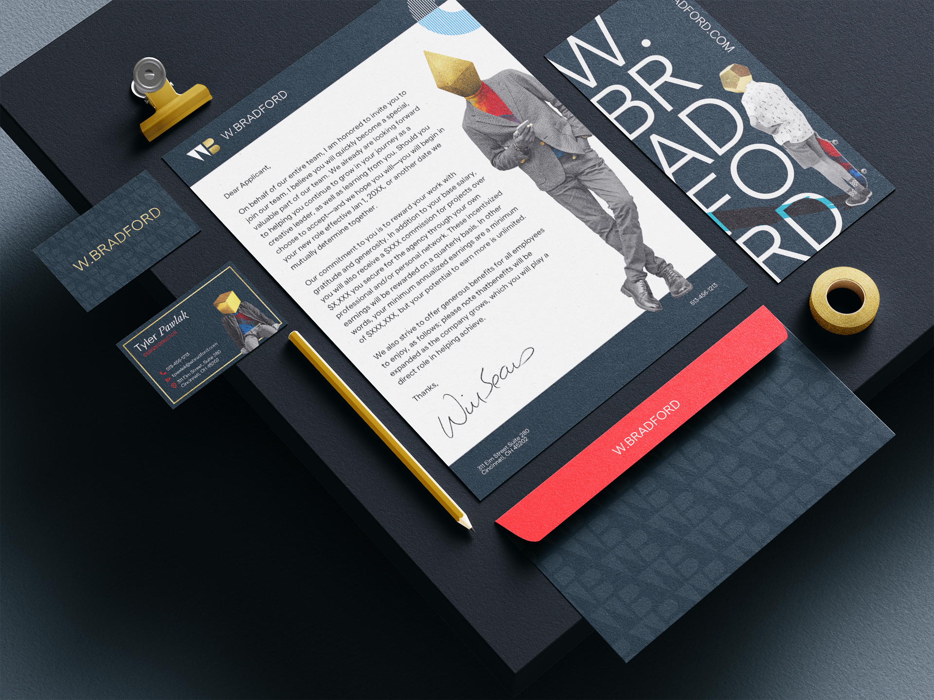
The agency wanted to walk a fine line when presenting itself to the world. On one side of the scale, we wanted to show the agency as a creative powerhouse that has ideas that are out of the box and more adventurous than the industry standard. On the other side, we needed the brand to know when to get out of the way in areas like case studies or project decks so that the brand did not overpwer our client work.
We often thought of the brand as the frame that complimented the image without taking away from the main subject.
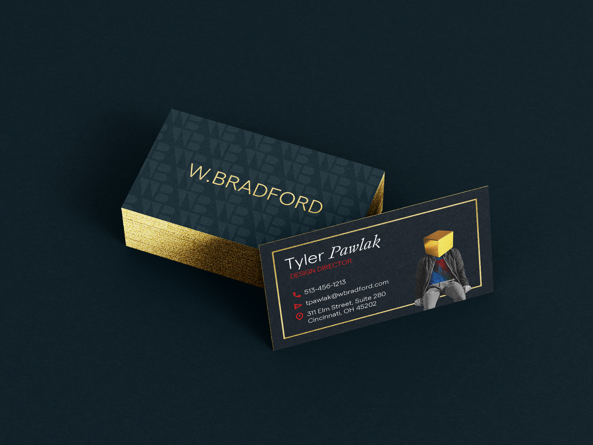
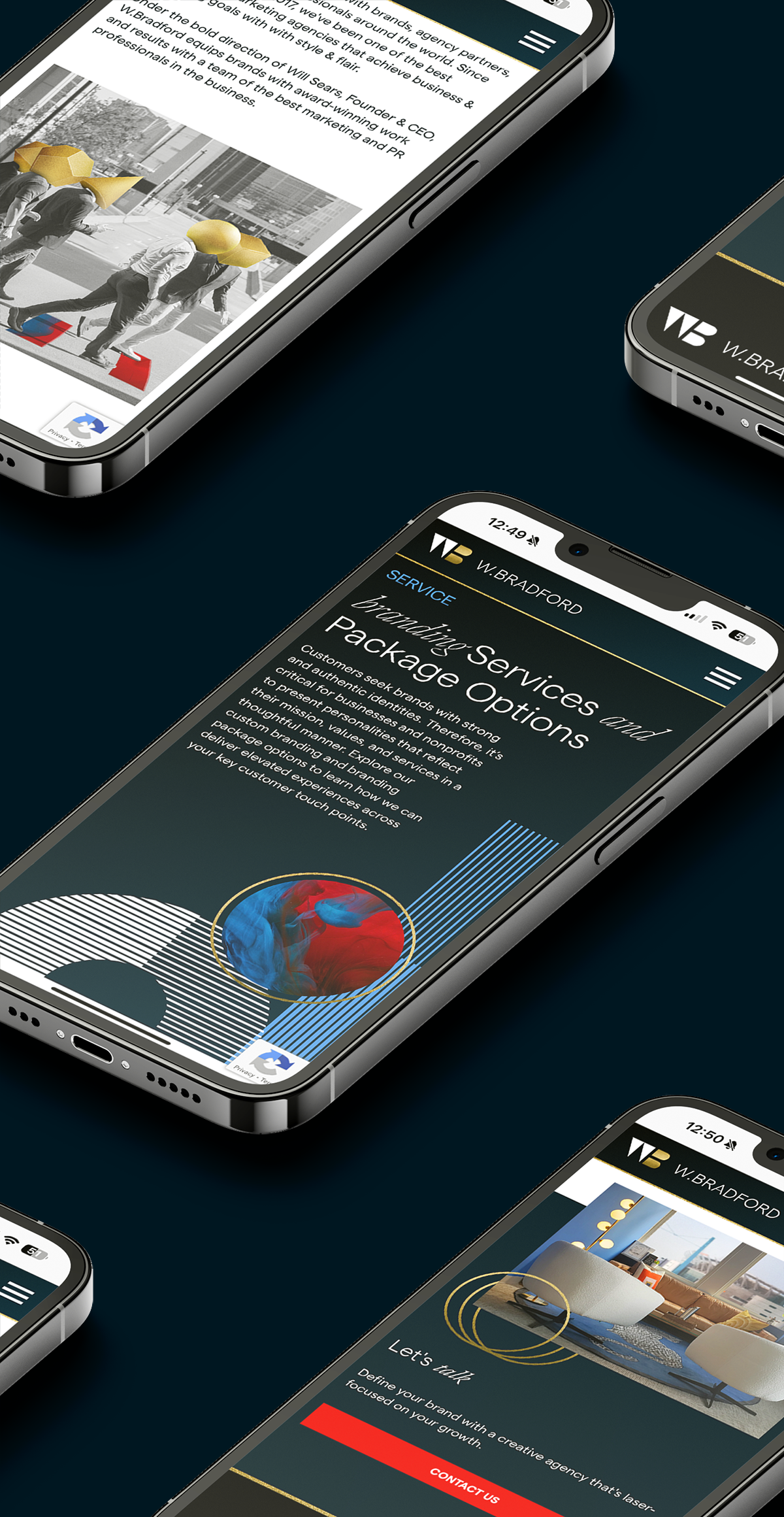
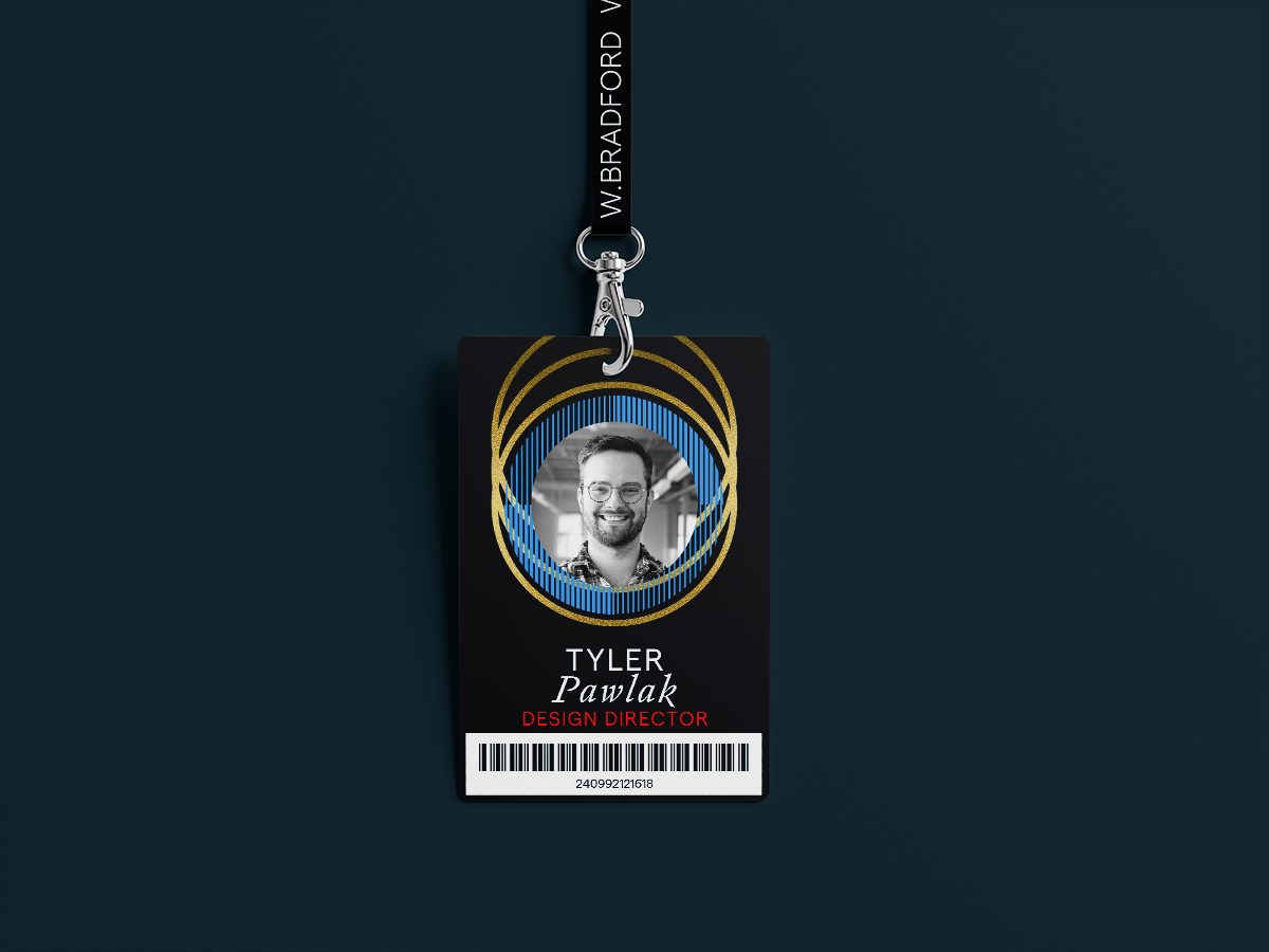
When acting alone, the visual elements took center stage and became the star of the show. The metallic gold texture took the lead in creating the visual style, showing up in nearly every aspect of the brand. A set of characters were created to represent the team members, each with their head replaced by a golden shape to show the unification of the team to have “golden ideas” while still showing personal style and individualism. A series of hands were also designed for the hero of the interior pages of the website to show a personal touch to our work, setting us apart from the AI dependent sector of the marketing world.
When client work is shown, the brand takes the backseat and uses subtle gradients and strategic touches of gold and patterns to not shy away from the established visual style, but allow it to compliment rather than overtake the shown work.
