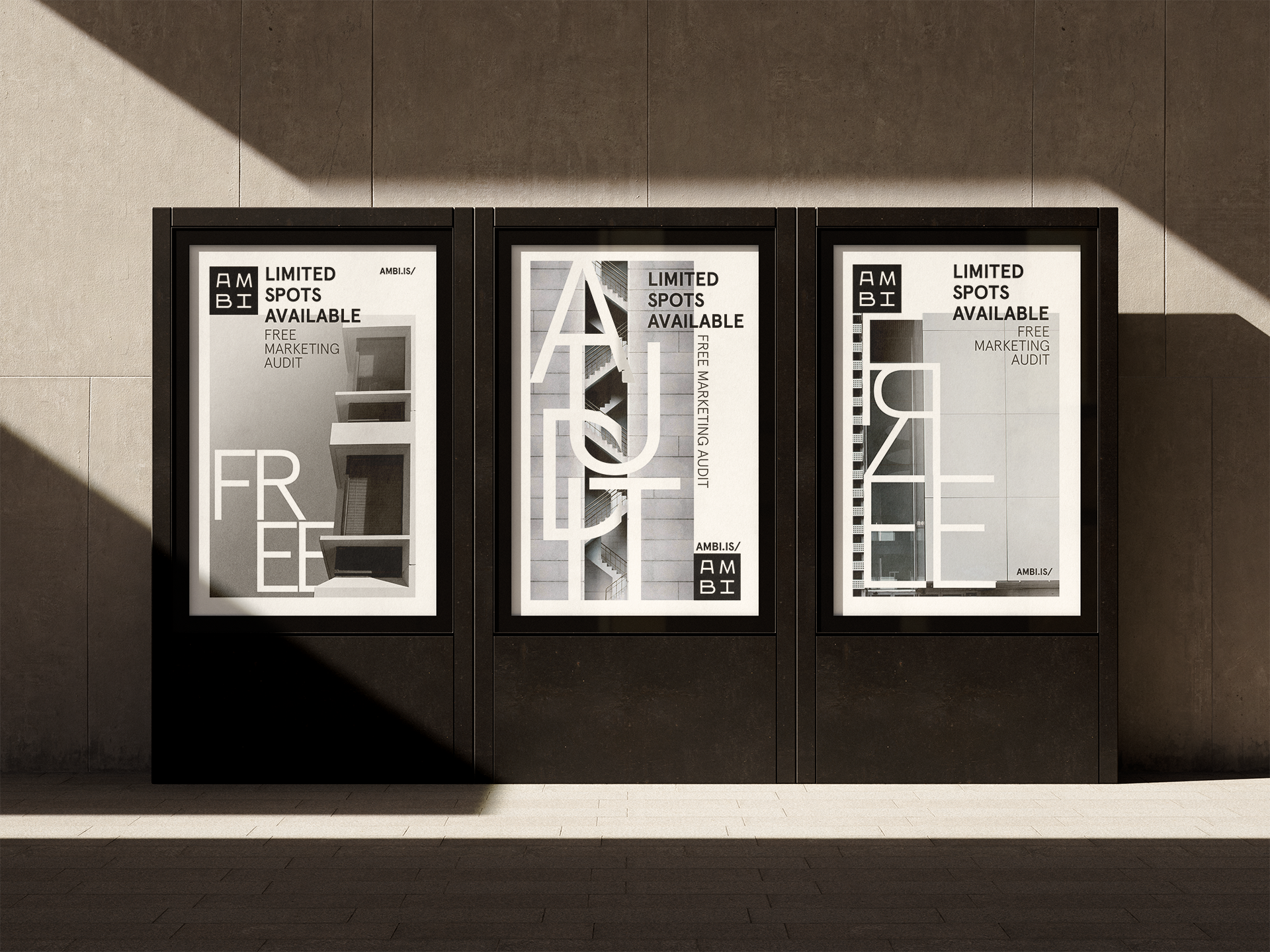
AMBI is a sister company to W.Bradford focused on B2B clients in the built environment. The brand has taken control of that side of the greater client list to show specialization and expertise to potential clients.
The AMBI logo and look had to speak to the decision makers in companies that specialized in the built environment. This meant the idea of AMBI’s client list had to be visually spoken to to differentiate it from W.Bradford.
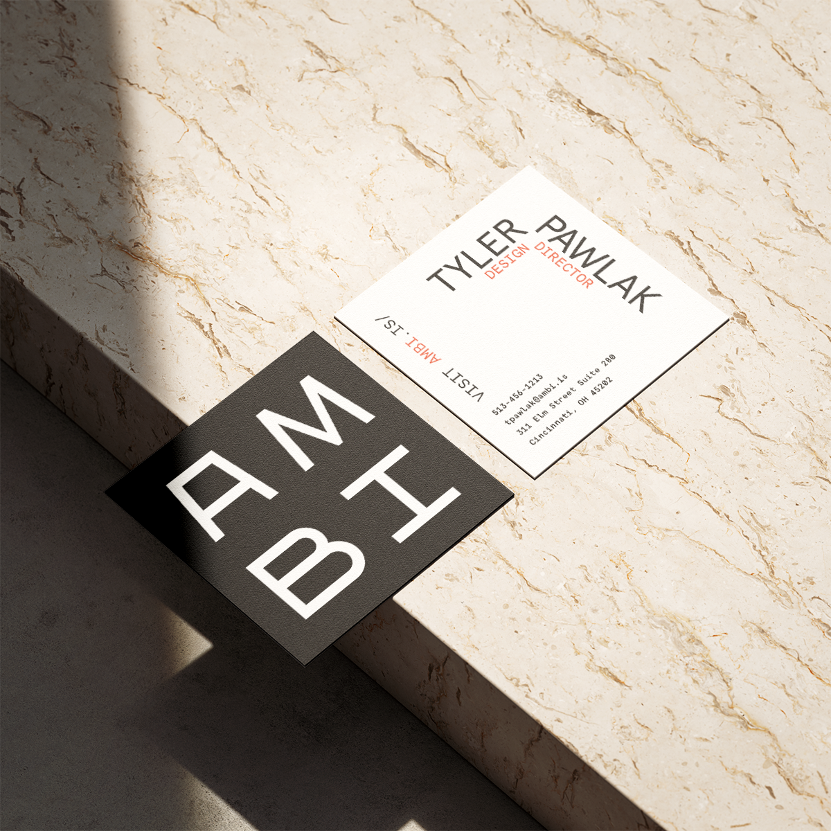
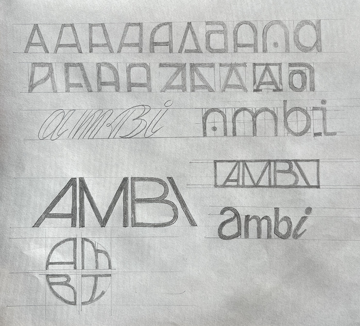
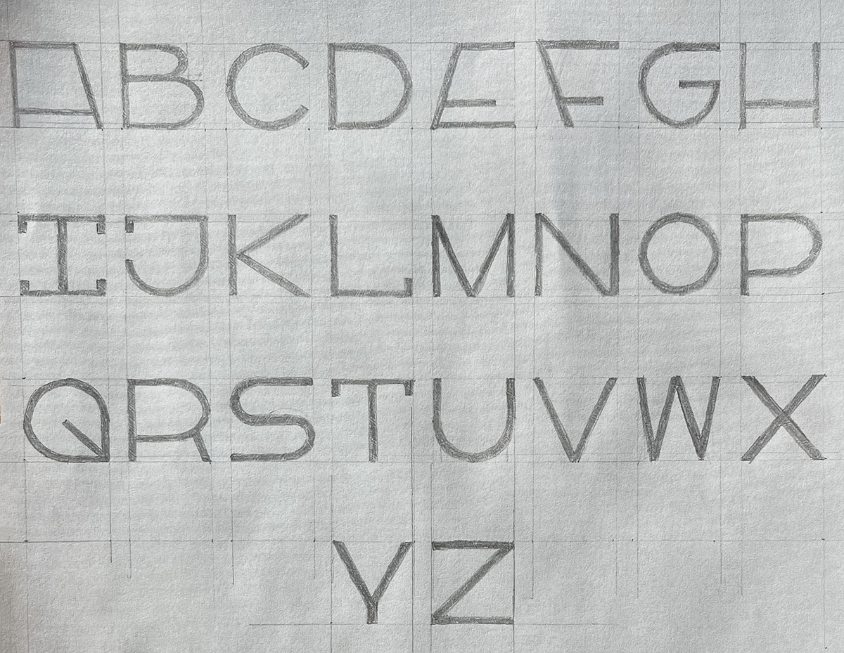
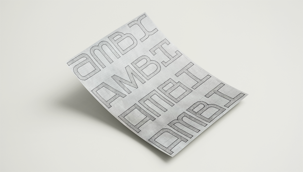
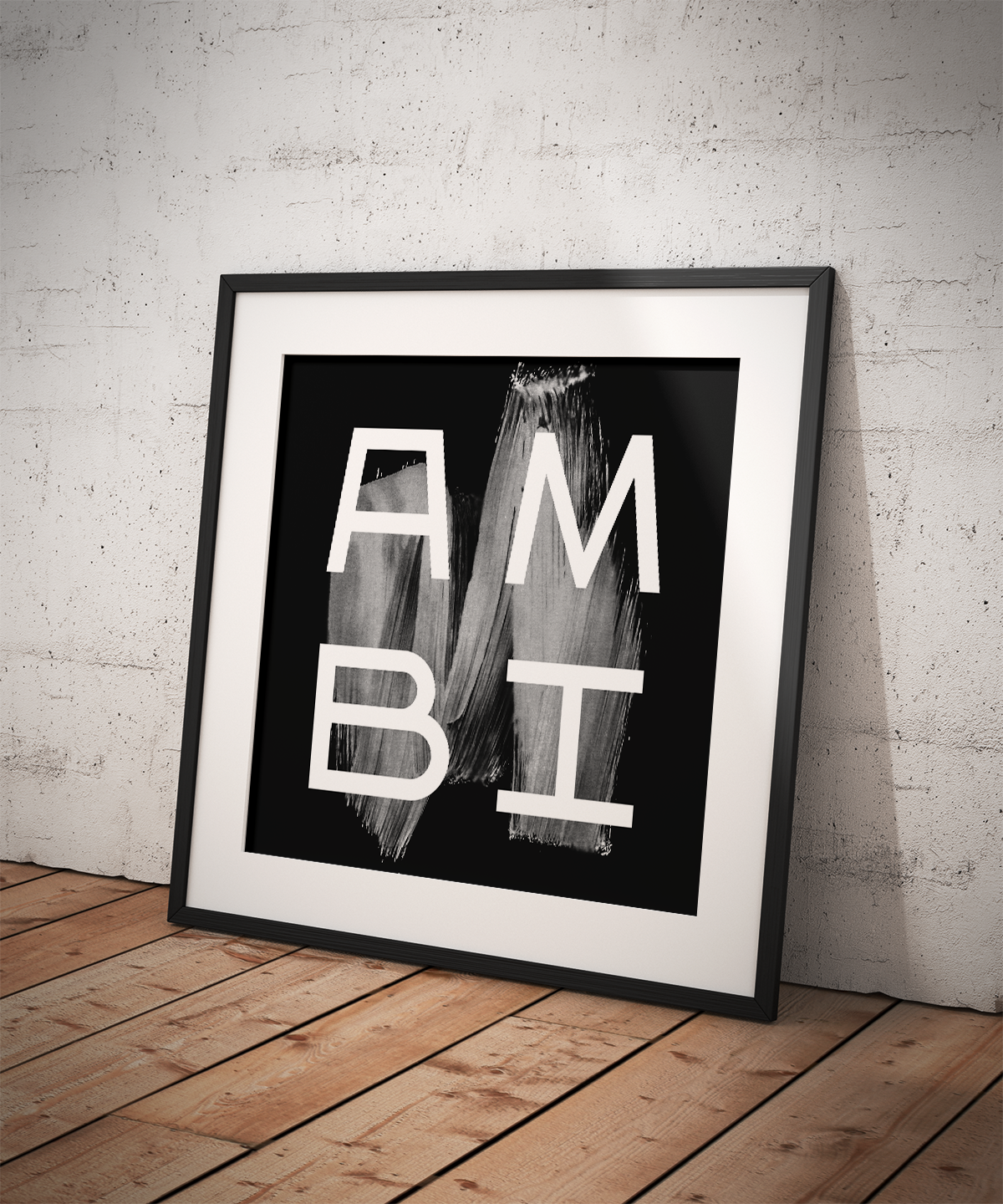
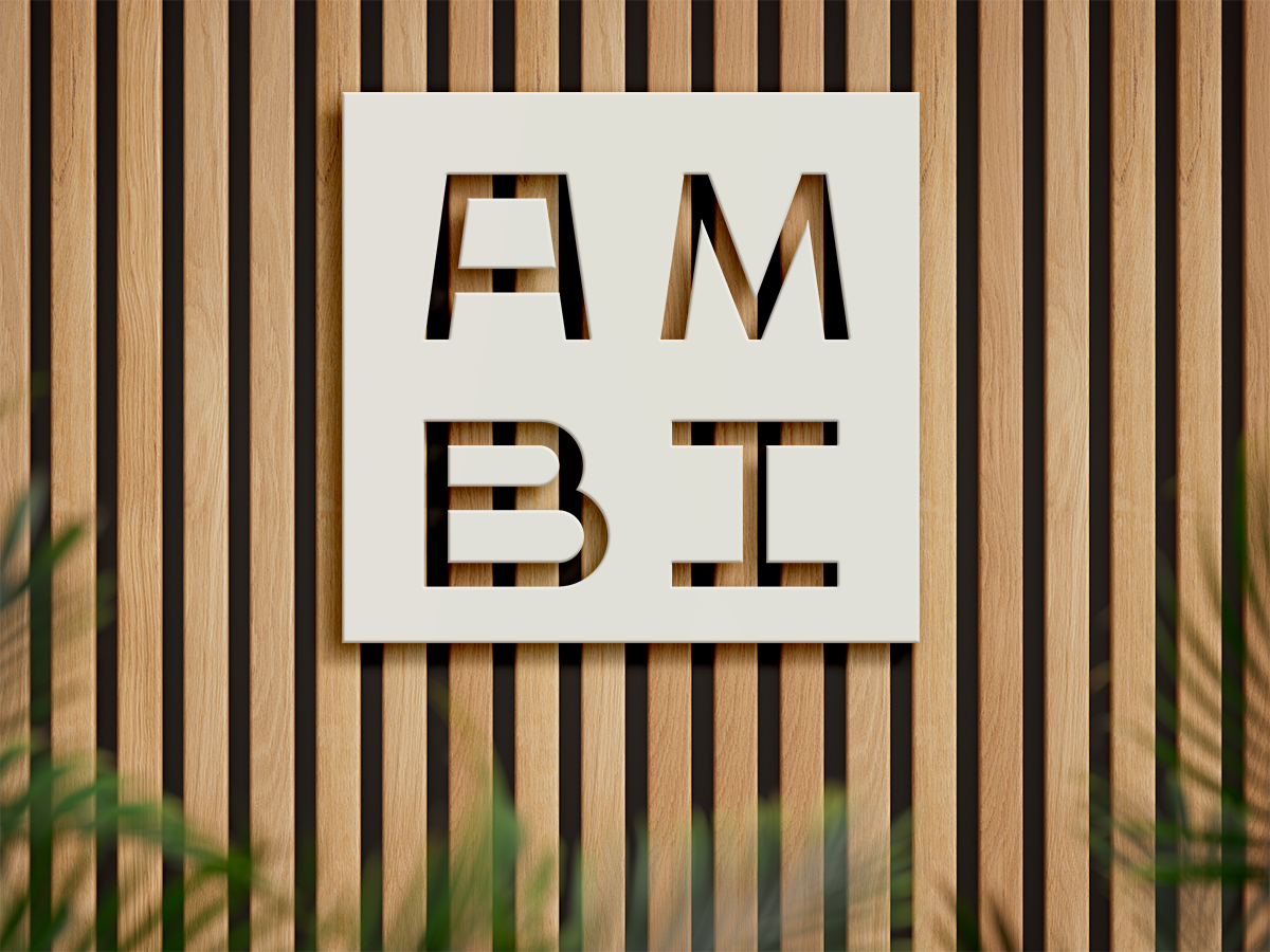
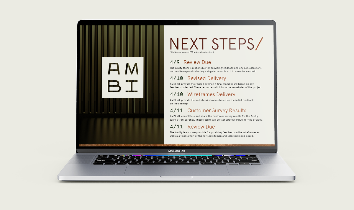
A wordmark was created from scratch to ensure control over every element of the logo to properly balance the letterforms and convey the intended message. The letters themselves are modular, able to split from each other to show flexibility and highlight the key markets for AMBI: Architecture, Materials, Building Services, and Illumination. The resting form for the logo is in a two by two square lockup of the letters, showing strength and stability. Each letterform was carefully crafted to properly balance the adjacent glyphs.
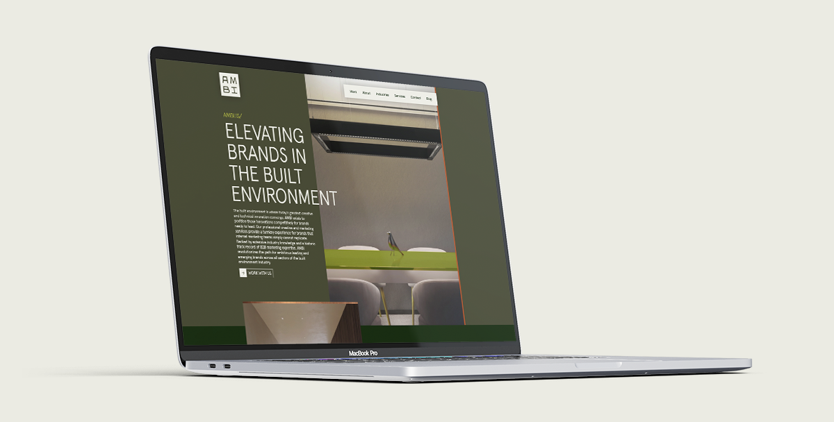
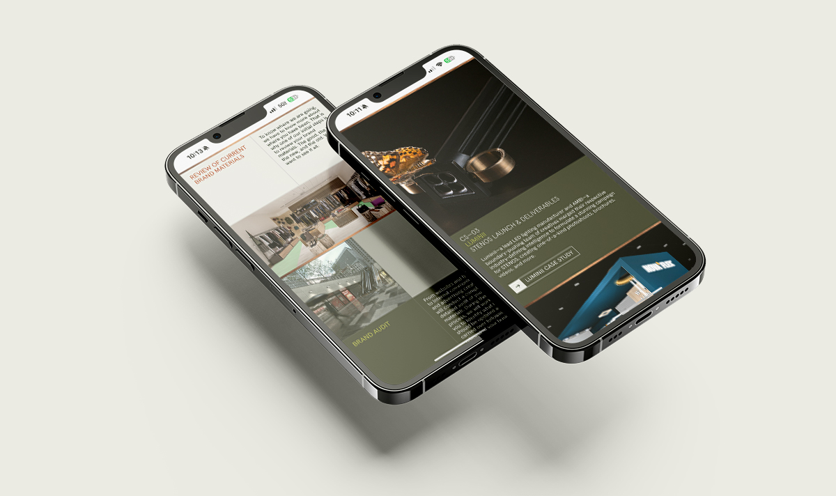
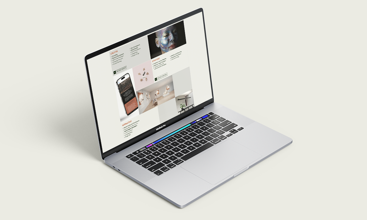
The design of the website closely followed the ideas established by the logo. Many of the sections are arranged in a clearly defined grid, playing off the two by two grid of the logo while further establishing structure. This seeming rigidity speaks to the ideal client where they feel comfortable as many of them are in highly technical and formulaic industries. The imagery of the website also acts as a mirror, showing clients examples of the industries they are in alongside work we created for other clients to show the potential of our services.
